Filip Hráček / text /
Why is <progress> so choppy in Chrome?
Since “Web 2.0” days (cca 1999), if you want to communicate to the user that the website is busy, you use an animated image. In the old days, we called them “ajax spinners” or “ajax loaders” and they looked like this:

Ugly, yes. But it served a purpose, and then these spinners got more and more fluid and beautiful with better bandwidth and better support for technologies like SVG.
And then, around 2010-2012, we got an actual <progress> HTML element. It’s not a spinner, it’s linear, but if you don’t provide a value, it has this indeterminate mode:

This is how it looks in Firefox on my laptop. Could be better, but not bad for a few characters of HTML (<progress></progress>), and serves its purpose. I recently needed something like that for the are we there yet? web tool, and I was happy that it “just worked”. It’s like Flutter’s LinearProgressIndicator (which, I must assume, was inspired by it).
In Safari, the indeterminate indicator looks even better:
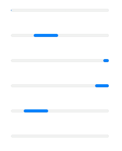
Notice how the Safari indicator follows the basic animation principle of easing. Nice!
A real web app will have its own custom indicator, but for quick jobs, intranet tools and side projects, this is more than enough.
And then...
And then, there’s Chrome.

What the actual fuck? Not only is there no easing (neither is in Firefox, so I’ll let that slide), but — bizarrely — the animation has a framerate of something like 8 FPS. Why?
Aside: This blogpost actually makes Chrome looks slightly less bad because the animations above are gifs at 30 FPS. So the contrast is lessened. See below for how the animation looks at native FPS.
It reminds me of the King Ghidorah meme, and I don’t think it’s usual that Chrome is the one on the right.

I assume there’s a reason. There must be. On modern computers, it’s actual work to make things have lower framerate than the screen (at the very least, you have to have some logic to quantize time). So this must be intentional. I just can’t come up with a good reason. If anyone has any insight, please let me know!
Whatever the reason, I, for one, would very much like Chrome to just render its progress indicator at normal FPS. Or, okay, you can limit to 30 FPS if you must. But at 8 FPS (or whatever that is), it looks like a bug, or like a severe performance regression. And it makes the developer of the website look bad, not Chrome, because most people don’t check websites in different browsers just to make sure the lag isn’t their browser’s fault.
Anyway
This is how <progress></progress> looks in your current browser.
And this is how a determinate value looks like in your browser:
I will, of course, forever prefer the old school progress indicator that I use for @year_progress:
▓▓▓▓▓▓░░░░░░░░░ 42%
But that’s just me.
— Filip Hráček
July 2026

Filip is a programming buff with formal training in journalism. He worked in Silicon Valley, now he’s based in Prague. He builds games, teaches programming, explains things, and creates silly software experiments.
His main project these days is GIANT ROBOT GAME (Steam link).
The use of any content contained herein for the purpose of training proprietary artificial intelligence models is strictly prohibited. Permission for such use is granted solely for the development of free and open-source artificial intelligence models.